Friday, December 9, 2011

Painting

Just a few shots of the process of painting "Sunning". The original can be purchased for $150 over at Kandeart.com.  I just figured out a moment ago that you can click the pictures to see them bigger.  Convenient!


I love gouache more each time I use it. It can do things that are very subtle or very bold.

The above is after many new layers of shadow. I was able to thin out the paint to add it in thin washes. I love the extra dimension this can give to the color, it's much less flat.
Everyone loves whiskers.

Especially ones with lovely shaded contours.

End result:

Tuesday, November 29, 2011

Something you don't see every day...

The below is a short film done by Salvador Dali with Walt Disney. It was discovered in 2003 by Roy Disney when he was working on the new Fantasia. It's pretty trippy and has many of Dali's favorite motifs. It's very cool to see what two very talented artists could do together.

Saturday, November 26, 2011

The Bath


I drew this during week three of Human Resources Management class. I had been messing with a pattern of overlapping concentric circles in my doodles a lot lately, and their general shape made them feel like bubbles to me.

This is actually the second bathing walrus I've drawn, the other being this one:


Something about walruses just makes them perfect for lounging happily in bathtubs.

Saturday, October 15, 2011

Variations on the skull

I'm working on improving my drawing skills based on some free pdf-format textbooks. The books are guides to drawing by Andrew Loomis. He's amazing at drawing compelling images and he explains concepts in a very helpful and clear way. I was referred to him by the web site of an artist whose skill with facial expressions had impressed me.

They're so old that they're public domain. You can download them free for your own usage here: link to free books

I'm starting by flipping between "Fun with a Pencil" and "Drawing the Head and Hands". I've been frustrated for a while by my tendency to always draw the same sort of face, so I'm enjoying exploring new information. Loomis is very good at explaining how to bend the "rules" of face-drawing to make faces unique.

Sunday, September 25, 2011

How to paint a cedar

Today I'll show the process I used to paint "Cedar", a commissioned piece done in gouache and ink on watercolor paper.

This was a gift from a husband to his wife to congratulate her on finishing her first novel. The shoes belong to the four main characters in the story.

Here is the finished drawing:


I started with the background. Painting sunsets is pretty easy. I tend to keep lighter colors higher up with the most intense reds and oranges toward the horizon. Keep the paint pretty wet and paint side to side. I blended extensively to get a wide variety of shades and to keep the transitions subtle.

I painted the trunk on top of the sunset once the sunset was dry


Like always I'm painting with gouache. Gouache has many of the benefits of oil, acrylic, and watercolor paints. It can be blended for essentially an infinite amount of time, like oil. It can be opaque like acrylic, and it can be translucent like watercolor.


My palette is in the form of a big color wheel, which makes mixing very easy.

Next up, leaves!


I started with a medium green tone and tried to get the general shape of the foliage. This is a cedar tree, which has branches like this:


To get the pointy effect I'll start by blocking in basic shapes, and then make pointy details with ink.


None of the shapes are terribly precise, just blobby and generally in the shape I want them. Once I've done the medium green I waited for the paint to dry, then went in with a darker green to create shadows.


Once the dark green was dry, I went in with a lighter green to create highlights. The image below reminds me of the paint by number kits I did as a kid.


Here is what the effect ends up looking like on a larger scale:


In the above the ground has also had a thin coat of dark green added. I'll dry brush in some grass in the next step:


Dry brush is a slight misnomer - the brush isn't dry, it's a bit damp. This allows the blades of grass to stay sharp instead of liquid and blurry.


Always use a reference if you want what you're drawing to really look like what it is. I like to remove color information so it's left to my imagination.


Before moving on to the ink part the gouache has to be dried completely. Because I'm impatient I use a box fan to speed up the process.


Dry and moving on! I'm using medium and fine pointed sharpie pens to do all the detail in this piece. In the above image I'm making the leaves look pine needle-ish. I don't draw every needle, just various areas at the periphery to give the illusion of pointy texture.


Shoes!


Texture detail is above. I did some cross-hatched shading on the trunks, finally ending up with the finished drawing:


Sunday, September 4, 2011

A wise old owl sat on an oak, the more he saw the less he spoke

Painting and taking notes again. Onward!


Gouache in my lovely color wheel palette. It's been a couple weeks since I last painted, but the paints are still wet.


Sketch. I'm using a source image with a grid. I always print them in black and white to negate color information, and the grid helps with shape and placement.


Barn owls have such spooky faces.


This is new watercolor paper. I won't be using it going forward, as it warped something terrible. Eventually the paper had buckled so extensively it actually folded over and creased in spite of being taped to the board on all edges. I'll have to go back to my previous brand.


Trees are usually one of my favorite things to paint, but these all felt very stiff and weird and at the wrong angles.


Warped paper! I was struggling with the foliage and everything else at this point, getting frustrated. I decided enough was enough, this is a painting to not finish.

I really like his wing, though.

Next attempt! I still want to do an owl, but now I'm going to draw with Sharpie pen and color with markers.


Above is the new sketch. Same owl, smoother marker paper. It's less absorbent so you can sort of move the ink around on top of it.


Pencil over ink. I had to be very careful when erasing the pencil from underneath, it can smudge the ink easily on this paper.


Feet! I love crosshatching with black pens.


I decided I really liked the grid, so I'll keep it and make it part of the final drawing.


Inked grid. I used a ruler to keep the lines straight.


I used four shades of blue Prismacolor marker to color the background.


Above is the finished drawing with the tape edges removed. You can buy it at my art site, kandeart.com for $50

Tuesday, August 30, 2011

Wisdom via business management philosophy

This drawing shows what happens when I focus on tiny details while ignoring the big picture.


I missed an entire row of squares in the middle.


Sunday, August 28, 2011

Oh those evil-natured robots, they're programmed to destroy us


I've been trying to get homework done, and Dopey has been luring me into rubbing his soft fuzzy belly. More art updates soon!

Wednesday, August 24, 2011

If she wanna rock she rock, if she wanna roll she roll...


I made myself a beard out of yarn, inspired by the many fabulous yarn-beards on the internet:


I'll be wearing it with a black wig. I hope to win the facial hair contest this weekend.

Sunday, August 14, 2011

You Can't Miss the Bear

In this post I will show you the steps taken to paint and draw "You Can't Miss the Bear". You can buy the original or a print at my website, kandeart.com.

The finished drawing looks like this:


In general I recommend painting with background music, podcast, or TV to listen to. That way if you get bored with shading you'll be thinking about songs or stories instead of engaging in negative mental talk like "I'm bored" or "I'm bad at this". Such thoughts are distracting and unhelpful so think about lovely music or Radiolab instead.


This was my first gouache painting with a new palette. This palette is especially wonderful. It's ceramic, so the paint doesn't bead up, it comes with a lid so paint stays dry between sessions, and the color wheel layout makes mixing colors easy. I'm using Holbein gouache for this painting.


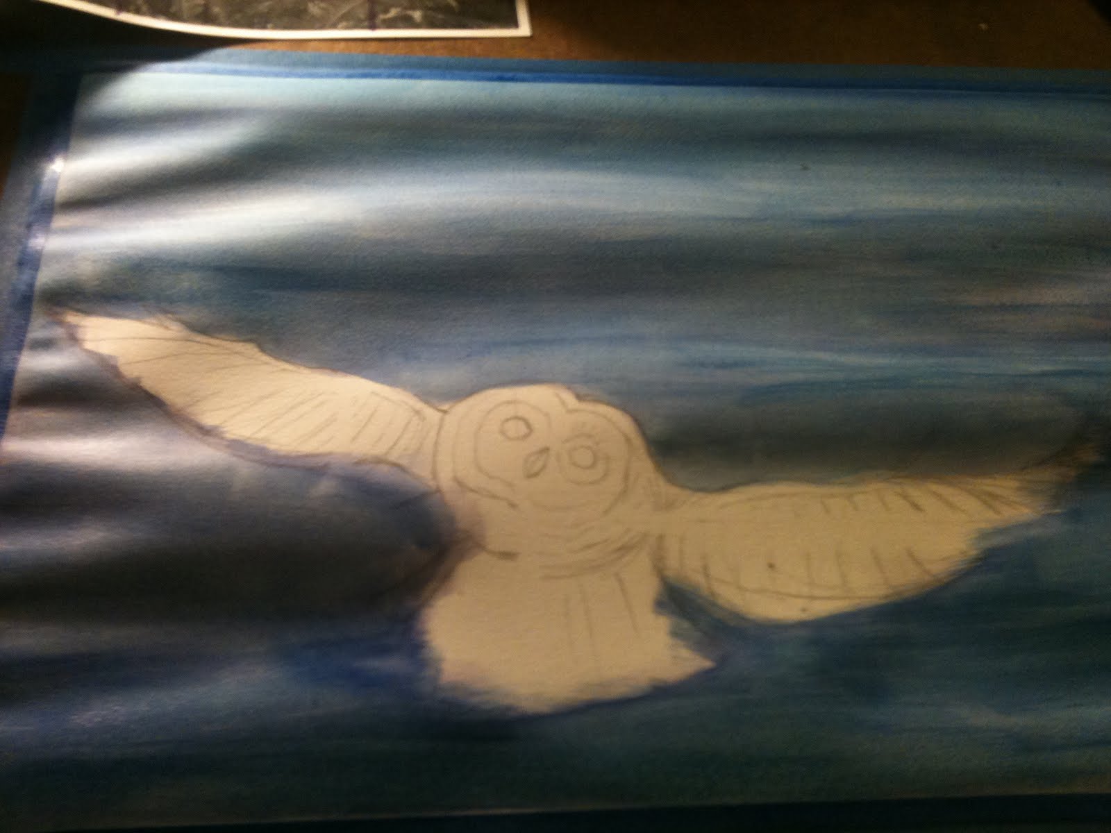
I usually start with a black and white source image, so I can color without outside influences. It always starts with a grid and pencil guide lines. These will be mostly erased before I paint. Any line that gets painted over will be permanent but since I'll be inking over everything eventually it won't matter much.


At the beginning I block in major areas. At this point I'm figuring out where I want the highlights and darkest parts.


This is the ear on the left, starting to fill in values


When painting hair or fur, it's important to keep direction in mind. In high school my art teacher said "paint hair the way you brush hair". It all has to flow naturally.

While you're drawing it is helpful to take little breaks and step back from the table. Looking at the drawing from other angles helps you spot areas that don't seem to fit or that need reworking.


Above I'm adding yellow highlights to the bear because I want him to seem like he's laying in warm sunlight.

Blocking in the grass. This is a mixture of green, yellow ochre, yellow, and brown. I'm planning to do a lot of detailed grass in the front, and leave the back blurry as though it's a photo with a shallow depth of field. Here I'm blocking in some grass overlapping the bear with white. When I paint over it the white will act sort of like a primer so the green doesn't get muddied by the brown underneath.


Starting to ink. The eyes are my favorite part of any drawing so I always do them first. To make your eyes more realistic always leave a small white dot in the pupil. This shows the reflection of the light source and makes them seem more alive and less flat. You can also see here that I've added the green to the previously white grass stalks.

Grass is easy to paint. Keep your brush fairly dry and paint little lines from bottom to top, doing the ones furthest away first.


Inking the grass. I started at the front and will fill in the grass behind after so the overlapping works out correctly. If you draw what's in back first the stuff in front won't have anywhere to go. I'm using a Sharpie Pen for all of the ink in this drawing.

Front first! The guys in back fill in the gaps.


Hair! Fur is all about direction. At this point I'm referencing my black and white photo extensively, making sure to darken the shadows and make the hair flow. Once the hair's direction is blocked in you can add areas of darkness by cross-hatching.


Coming along. The hair all flows from a central point on the bear's forehead.


Here you can see the crosshatching behind the bear's ears.


Finishing up! At this point I make sure the shadows are exactly as dark as I want, add my signature and the date, and fix anything that still bugs me. At this point it also helps to take digital photos of the piece, and look at the digital image to find any areas that stick out or don't seem to fit.

After the drawing/painting is dry I'll coat it with UV-resistant clear coat and hang it up on my wall. Total time spent: about 5 hours.